
Website Information Architecture Redesign
Making Shelter Information Easier to Access
I redesigned the information architecture of the Dorothy Day House website to make it easier for users to navigate and find essential information about shelters and support services. The redesign was informed by user interviews, website analytics, competitive analysis, and heuristic analysis.
Background
Dorothy Day House provides meals, shelter, and other services to people experiencing homelessness in Berkeley. Its website serves several audiences, including donors, volunteers, and people seeking support. But these audiences have different needs. Someone interested in volunteering might have time to explore the website, while someone searching for shelter might need clear information about available services, hours, and what to do next.
Organization: Dorothy Day House
My role: UX Research & Design
Duration: four Weeks (2026)
Tools: Figma, Squarespace.
Project will be release by Nov 2026
I worked with Bess Design Studio to investigate these barriers and rethink how the website organized and presented essential information. Our goal was to make finding shelter and services more direct, understandable, and accessible.
The website lacked clarity and purpose
The Problem
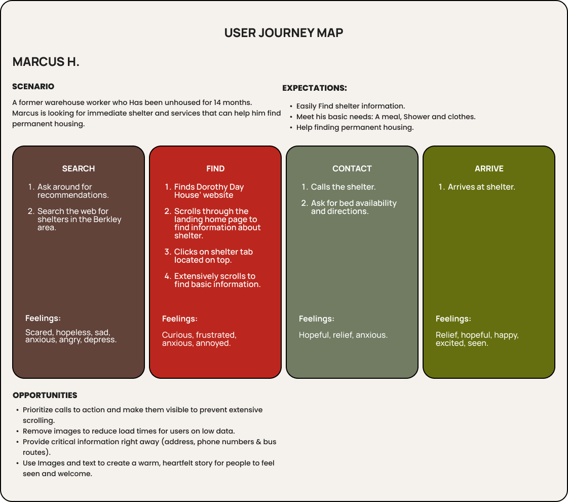
Imagine a person experiencing homelessness and getting information about a shelter that provides beds, meals, and showers. Then traveling an hour and finding out that showers closed 10 minutes ago and being turned away because they need to register ahead of time to access the shelter.
Prioritizing the needs of those looking for services:
DorohtyHouse.org reaches several audiences. Promoting donations, followed by volunteer sign-ups, are important to the organization's long-term operations, while finding shelter may be more urgent for a person in immediate need.
The strategic question became:
How do we improve access to shelter and essential services pages without neglecting the organization's needs for donors and volunteers?
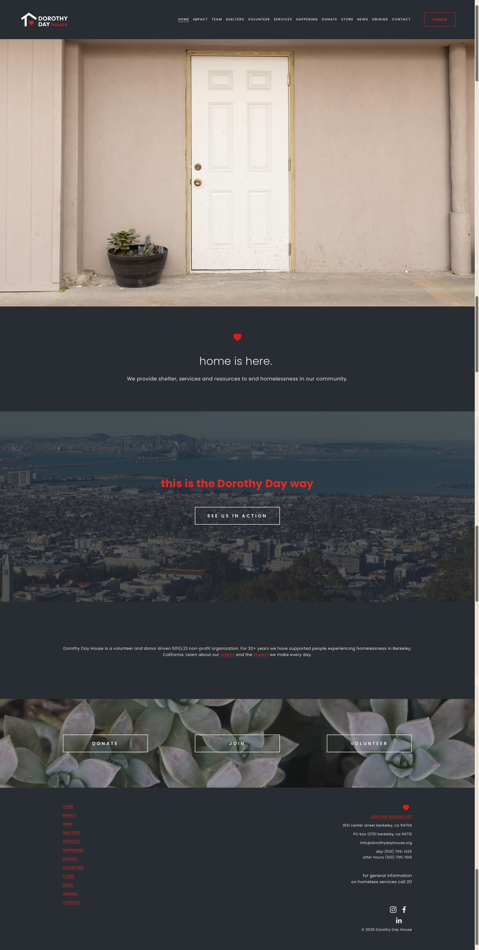
Original Landing Page.
Research & Discovery
Understanding patterns and people’s stories to form a clear picture
Through the use of different research methodologies, we were able to understand where users struggled and identify opportunities to make essential information and services easier to find.
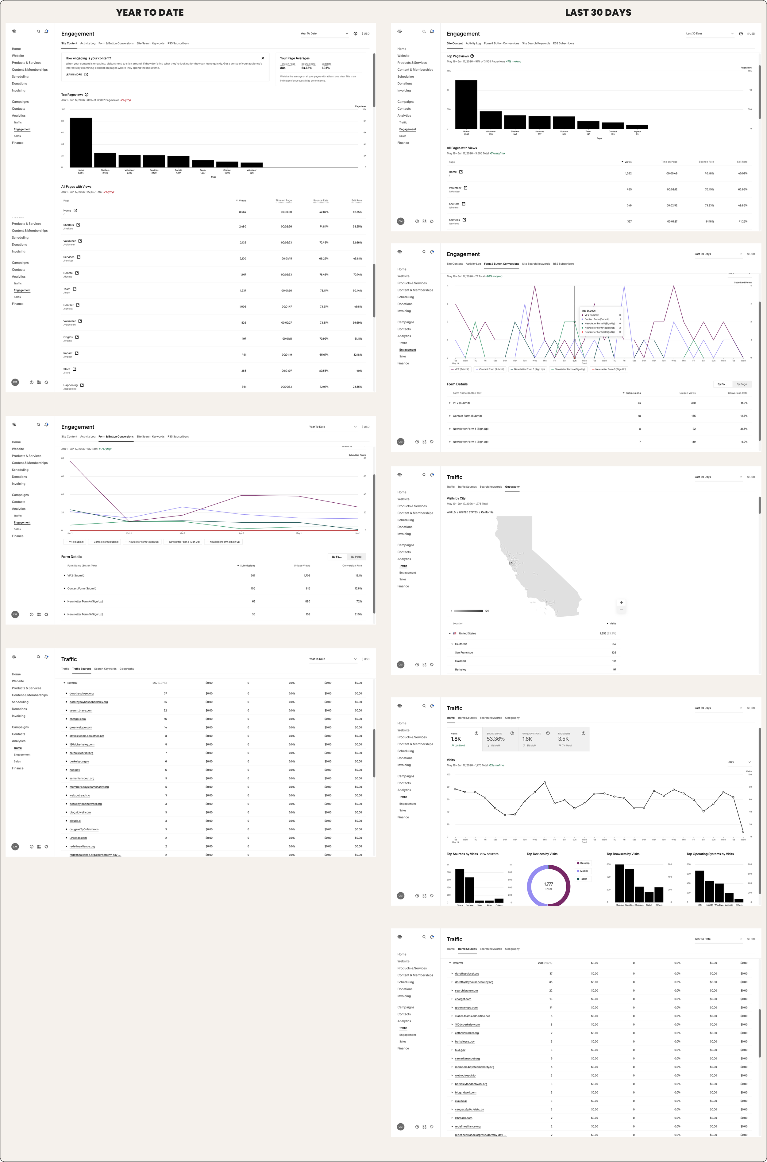
Website analytics:
We found out that the shelter page was the most visited page follow by vonlunteer and donors page. This made us create a list of priorities and CTAs based on data.
User interviews:
This was crucial to understanding the diversity of users, from individuals experiencing homelessness themselves to organizations helping their clients find services.
“I didn't know what bus route to take. I had to figure it out on my own.”
“When I landed on the homepage, I found an image, then I scrolled down and couldn't find any information about the shelter.”
“It will be helpful if the hours for each activity are posted underneath each shelter.”
Through the interviews, we realized how crucial service schedules are for people who rely on public showers, food and other services. Lack of clear requirements and instructions can create more frustration in an already precarious situation.
Competitive Anlysis:
We learned that having numbers along with clear information about the organization's outcomes can incentivize someone looking to volunteer or donate money. It also creates trust among other organizations that refer clients.
An easy-to-find call to action, clear language, and relevant data are the most important tools to engage users. Images of people can create a deeper connection and support written stories.
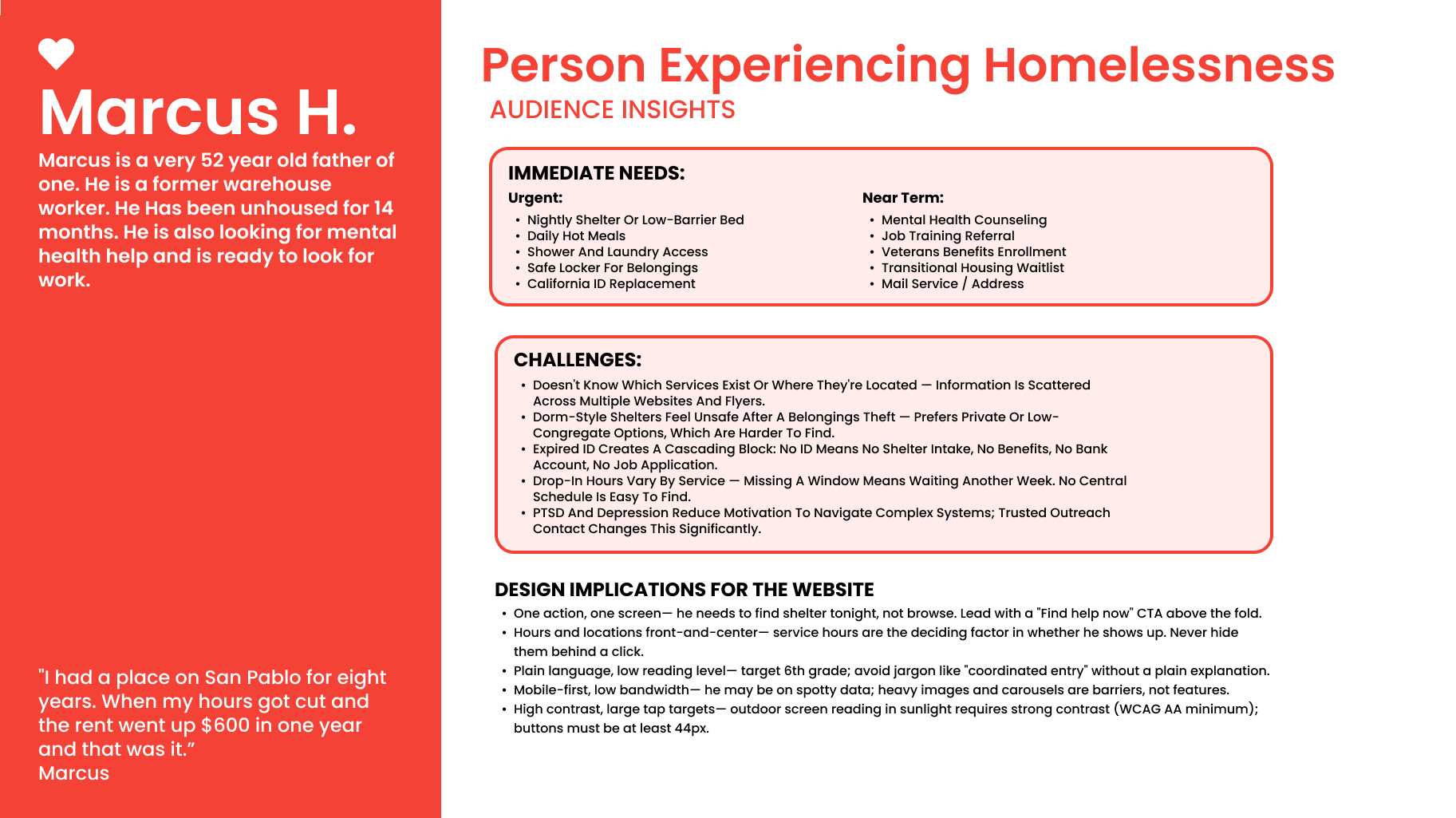
Personas helped us keep in mind who we were designing for while providing insights based on real needs. At the same time, a Heuristic Analysis of the current page was essential to focus on the part of the user journey that was making it difficult or preventing users from achieving their goal.
Observation:
People needed more than a list of services.
Interview feedback pointed to difficulty finding shelter information, understanding directions, and identifying service hours.
Classifying information
Insights:
Finding a service is only one part of accessing it.
People also need practical information to determine whether a service fits their needs and how to get there.
This is an interpretation of the interview quotes, not a direct finding about every visitor.
Design Implications
Present essential information together.
Group service details, hours, location, transportation guidance, and clear next steps in one easy-to-scan place, where individuals and organizations can verify and provide that information.
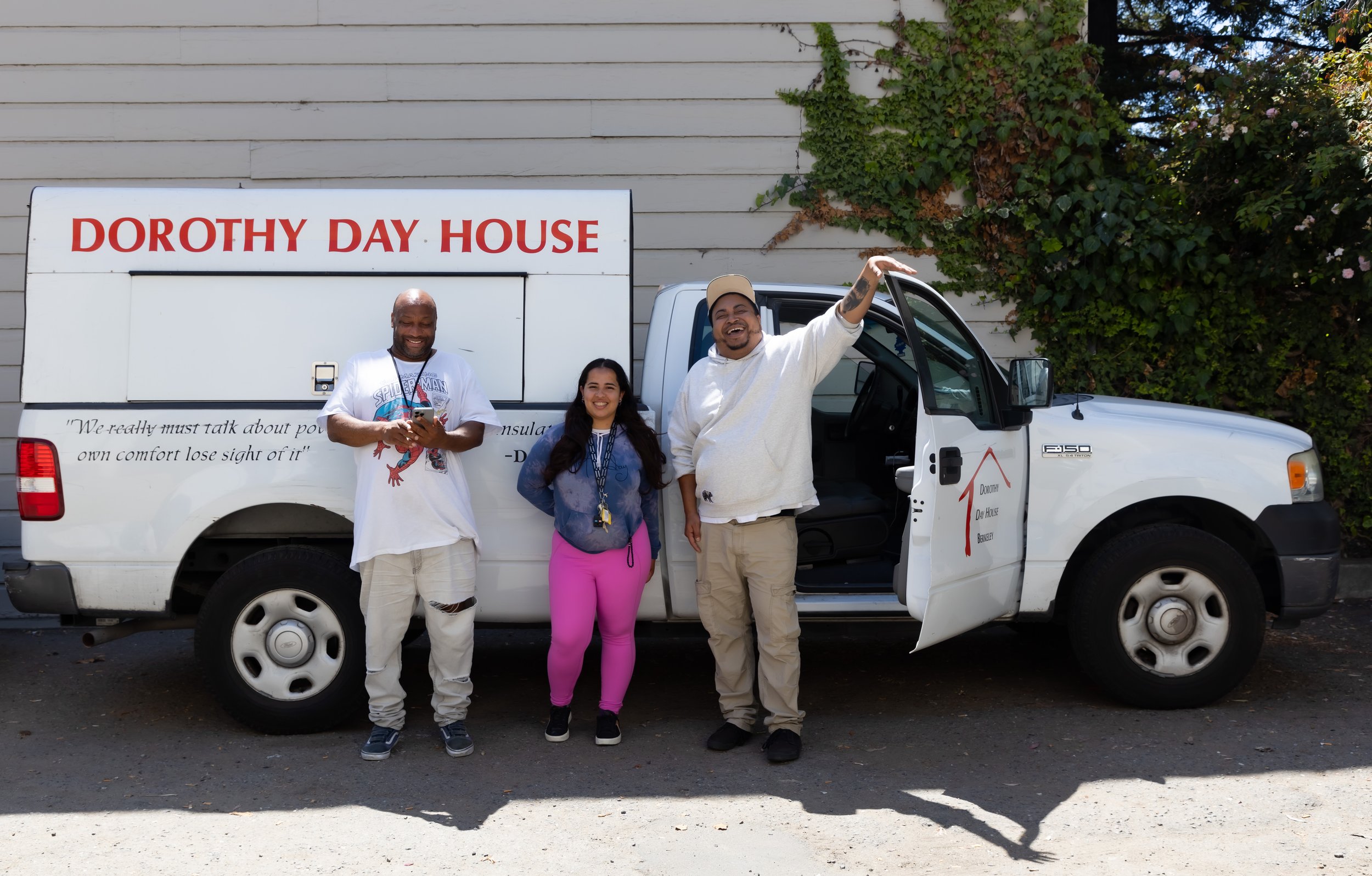
Photo by: Christy Mack
Organizing priorities:
Priority 1 — Access to shelter and services
Make the most important service information and next steps immediately visible.
Priority 2 — Practical information
Improve the visibility and consistency of hours, locations, transportation details, and service descriptions.
Priority 3 — Organizational engagement
Preserve clear pathways for donations and volunteering while giving service-seeking visitors a more direct route to the information they need.
Prototyping
Desinging an experience that actualy meets people’s needs
We began our ideation phase understanding that the new website needed to:
Prioritize calls to action for people looking for shelter on the homepage without neglecting donors and volunteers.
Select photos and videos that communicate what Dorothy Day House is about, helping form memorable connections with those visiting the website, while making people experiencing homelessness feel welcome and seen.
Reduce scrolling by prioritizing important information and eliminating non-essential text.
Increase contrast to make CTA’s and key information easier to see.
Present critical information in a clear and easy-to-understand way.
Provide clear steps for people looking for services to reduce the unnecessary phone calls to the shelter
Takeaways
Digital experiences can be an important first step
Applying Dorothy Day's philosophy of treating people with love and kindness, this project was an excellent opportunity to use a human-centered design approach and tackle a small but significant part of the process of finding a shelter and services.
By talking to people experiencing homelessness, we uncovered a few ways in which Dorothy Day House can improve its process beyonde their website:
Clear information about how to access services can reduce calls and emails received by the Dorothy Day House team.
When reaching out to people on the streets, familiar faces build trust, and flyers with shelter information reach those without access to the internet.
Making schedules visible, both physically and virtually, sets clear expectations.
This project will be live on November 2026